
| Custom Engraving Tips For Products | |||||||||||||||
|---|---|---|---|---|---|---|---|---|---|---|---|---|---|---|---|
|
1. Don't over specify your engraving request.
We use the best engraving equipment and our engravers have many years of experience.
We perform some of the best work in the industry.
Usually the more a customer specifies engraving details, the worse it looks.
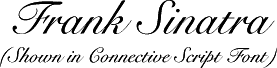
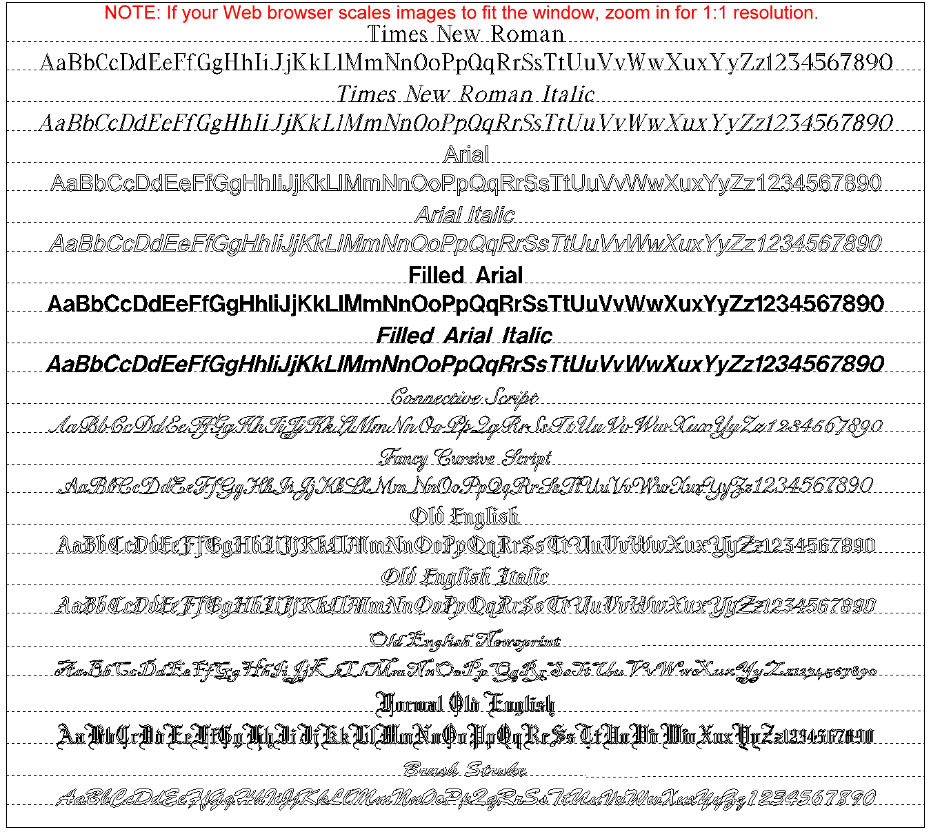
2. Many customers specify too many words per line. This forces the use of a small font size and makes the engraving hard to read. We will format it for best appearance, and we know not to break up names, company names, and dates. 3. For round or square engraving areas, the number of words per line is approximately equal to the number of lines. On round items, the engraving area should have a round shape, with shorter first and last lines. 4. It's all right to use one font for initials or a monogram, and another for a personal message but don't mix too many fonts within a message. One font and its italic are usually sufficient. 5. Formal Old English is fine for initials or a monogram, but never for long messages. Don't use any of the Old English fonts for lengthy messages as they are difficult to read. Don't use Old English Newsprint font unless you have a good reason and use it sparingly as it is very difficult to read. If your salutation contains the word "Love," consider Fancy Cursive Script or Connective Script fonts. If this is for business, consider Times New Roman or the italic version. If you have a lot of text on a small item and you know the font size will be very small, use Arial font. If you don't know which font will look best, leave the font selection for our Master Engraver who has over 30 years experience. 6. Unless otherwise specified, we center all engraving. It is almost always a mistake to right or left justify lines, especially on a round object. Engraved gifts should not look like business letters. Note that on the back of some brass compasses, there is a hardened steel compass pivot point on the exact center of the back of the compass. Since we cannot engrave on hardened steel, engraving on the back of these compasses should be broken into an even number of lines to straddle the center compass pivot point. Single lines of text and most monograms on the back of these compasses will be engraved on the top half above the compass pivot point. 7. Except for initials and monograms, never use all capitals with cursive or connective script fonts, or with any of the Old English fonts. All capital letters in script or Old English fonts don't even look like English: Initials are usually the best and safer choice. When in doubt, use initials as they are what most people relate to (who ever put a monogram on their lunch sack?). 9. If you have lengthy text, such as a poem or a long message, consider Times New Roman or Arial fonts. Script fonts are more difficult to read, especially when using a small font size. You never see a newspaper, novel, or book of poetry written in a script font. 10. Black oxidizing plaques makes the engraved letters stand out against the gold brass plaque and makes the plaque easier to read. Artwork or logos with fine crosshatching look better without oxidizing. Only bright brass plaques can be black oxidized, not aluminum plaques or engraved products such as brass telescopes or compasses. 11. Carefully check your grammar and spelling. We DO NOT check spelling. Whatever you enter in the engraving section is electronically routed to our engraving machines. We do not retype your engraving so we cannot make typographical errors. | |||||||||||||||
| Initials vs. Monogram | |||||||||||||||
| There is often confusion on the difference between initials and a monogram. Initials abbreviate a full name in the standard order of first, middle, and last name. For example, Franklin Delano Roosevelt's initials would be FDR. A monogram is where the first letter of the last name is placed in the center and made larger than the other two letters. In this way, Franklin Delano Roosevelt's monogram would be FRD. | |||||||||||||||
|
|||||||||||||||
| When ordering initials or a monogram, simply type the three letters in the order they will be engraved (i.e. FDR for initials and FRD for a monogram), then in the special instructions section specify whether you want initials or a monogram. If you desire a monogram, you may wish to specify that the center letter is larger for clarity. | |||||||||||||||
| More Personal | |||||||||||||||
Initials are great where space is limited, but people identify with their full name.
When space allows, consider engraving the recipient's full name.
 |
|||||||||||||||
| The Most Personal | |||||||||||||||
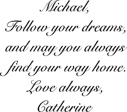
A heartfelt message definitely creates the most memorable and cherished gift.
Don't forget the recipient's name, your name, and a date for special events.
 |
 |
 |
 |
 |
 |
 |
